/* global React */
/* ============================================================
   Rev-Sizer & RevSizing — integrated into RevToolbox.
   Story: hardware → platform tabs (Variety Graphs, Distributions,
   Calculator, Reporting) → traceability → audiences → start.
   ============================================================ */

window.RevSizerPage = function RevSizerPage({ setRoute }) {
  const features = [
  { tag: 'ACCURACY', k: '0.5 mm', d: 'Banded-trigger design measures fruit circumference on the tree, precisely.' },
  { tag: 'THROUGHPUT', k: '3 000 fruit/d', d: 'A picker can measure three thousand fruit on the tree in a single day.' },
  { tag: 'CONNECTIVITY', k: 'Wi-Fi', d: 'Pre-load blocks on the platform; save block-by-block; sync over Wi-Fi to RevToolbox or your drive.' },
  { tag: 'DURABILITY', k: 'Water-resistant', d: 'Sealed for damp orchard conditions. Full-day battery.' }];


  // The four RevSizing tabs, now living inside RevToolbox V4.
  const platformTabs = [
  {
    idx: '2.1',
    tab: 'GRAPHS',
    title: 'Variety growth curves & weekly increments',
    copy: 'Plot every block of a cultivar against the regional average. Day zero is full bloom. The lower panel shows weekly fruit-growth increments — a flat week is usually under-irrigation. You see it before harvest, not at harvest.',
    bullets: [
    'Farm · Block · Variety toggle',
    'Regional cultivar average overlay',
    'DAFB or calendar-date x-axis',
    'Merge similar block codes'],

    file: 'assets/revsizing-variety-graphs.png',
    bgPos: 'left top'
  },
  {
    idx: '2.2',
    tab: 'FRUIT DISTRIBUTIONS',
    title: 'This week\u2019s size & the predicted count distribution',
    copy: 'See the measurement week\u2019s size histogram next to the predicted count distribution — 4 / 3 / 2 / 1 / 1x / 1xx / 1xxx / >1xxx. Block-by-block table underneath, packhouse-ready. Sequence harvests so every block goes when it\u2019s hitting target.',
    bullets: [
    'Frequency histogram in mm',
    'Predicted % into every count bin',
    'Per-block + totals table',
    'Filter farm → block → variety'],

    file: 'assets/revsizing-fruit-distributions.png',
    bgPos: 'center top'
  },
  {
    idx: '2.3',
    tab: 'REPORTING',
    title: 'Customisable PDF reports for packhouse & marketing',
    copy: 'One row per block — last measured size, increment, DAFB, expected pick date, predicted harvest size. Tick the layers you need (regional curves, harvest line, previous season average) and download a customised PDF. Effortless once set up.',
    bullets: [
    'Merge region average curves',
    'Add average harvest DAFB line',
    'Show previous season\u2019s average',
    'One-click PDF, share-ready'],

    file: 'assets/revsizing-reporting.png',
    bgPos: 'left top'
  }];


  // Supporting tools that round out the platform (Calculator, Spatial, Traceability).
  const supports = [
  {
    tag: 'CALCULATOR',
    title: 'Strategic thinning calculator',
    copy: 'Predictive distribution of fruit size ahead of harvest. See how much of the crop will fall outside market spec — and inform producers on minimum fruit-size targets for thinning, at any point in the season.',
    file: 'assets/portal-fruitsize-distributions.png',
    bgPos: 'center top'
  },
  {
    tag: 'SPATIAL VIEW',
    title: 'Size mapped to GPS, per tree',
    copy: 'Average fruit size mapped onto the block. Find the corner that always under-sizes before it costs you a grade. Stack four years of NDVI, soil chemistry and EMI alongside.',
    file: 'assets/portal-block-m11-fruitsize.png',
    bgPos: 'center'
  },
  {
    tag: 'TRACEABILITY',
    title: 'Farm · Block · Variety, one number',
    copy: 'Every reading carries GPS, picker ID and timestamp. Drill from regional average down to one tree. Marketers, packhouses and producers see the same forecast, with the data trail behind it.',
    file: 'assets/portal-farm-fruitsize-mosplaas.png',
    bgPos: 'center top'
  }];


  const audience = [
  { num: 'I', t: 'Producers', d: 'Plan thinning and irrigation by block. Spot under-size early enough to act.' },
  { num: 'II', t: 'Packhouses', d: 'Forecast incoming size distribution. Sequence harvests by target market class.' },
  { num: 'III', t: 'Marketers', d: 'Predict premium-pricing volumes per cultivar before the season closes.' },
  { num: 'IV', t: 'Logisticians', d: 'Filter farm → block → variety. See expected size classes per shipment.' }];


  return (
    <>
      {/* Hero ============================================== */}
      <header className="page-head hero-bg" data-img-file="assets/revsizing-fruit-distributions.png" style={{ '--page-head-bg': "url('assets/revsizing-fruit-distributions.png')", minHeight: 540 }}>
        <div className="container-wide">
          <div className="crumbs">
            <a href="#" onClick={(e) => {e.preventDefault();setRoute('home');}}>Home</a>
            <span>/</span>
            <a href="#" onClick={(e) => {e.preventDefault();setRoute('revscout-s');}}>Tools</a>
            <span>/</span>
            <span>Rev-Sizer &amp; RevSizing</span>
          </div>
          <h1>Know what you're going to send to market — <em>before the competition</em>.</h1>
          <p className="lede">
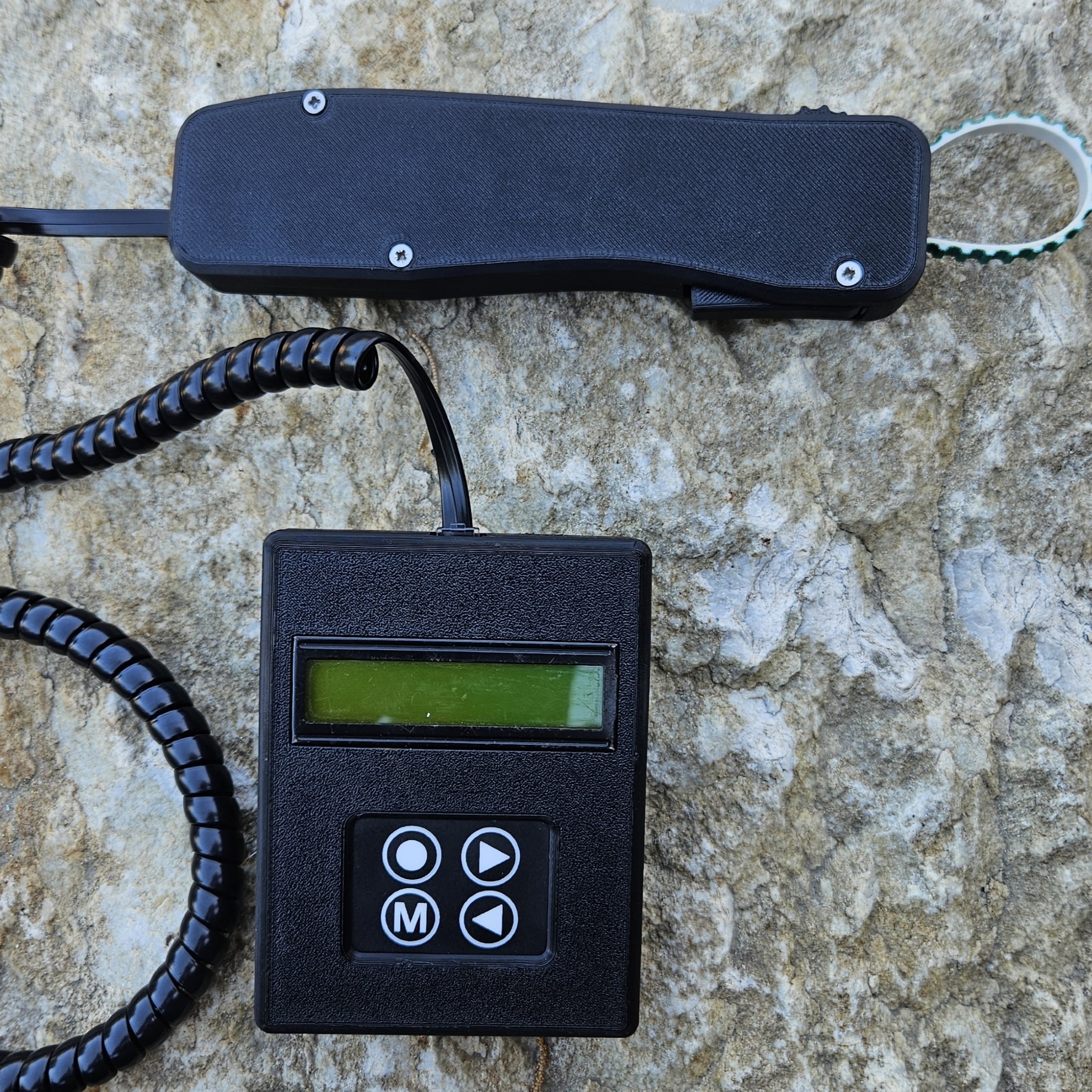
Fruit-size distribution drives seasonal profit more than raw tonnage. The Rev-Sizer measures fruit on the tree to 0.5 mm — no picking required. RevSizing — now a module inside RevToolbox V4 — predicts where the season lands and pushes the forecast to packhouse, marketing and logistics in the same workspace.</p>
          <div className="hero-actions" style={{ marginTop: 'var(--space-3)' }}>
            <a className="btn btn-primary btn-lg" href="#" onClick={(e) => {e.preventDefault();setRoute('contact');}}>Talk to an agronomist →</a>
            <a className="btn btn-light btn-lg" href="http://revtoolbox.co.za" target="_blank" rel="noreferrer">Open RevToolbox ↗</a>
          </div>
        </div>
      </header>

      {/* 01 · Hardware ===================================== */}
      <section className="section">
        <div className="container-wide">
          <div className="rs-hardware-grid">
            <div>
              <div className="section-eyebrow">01 · The hardware</div>
              <h2 className="section-title">Rev-Sizer.<br /><em>Banded-trigger digital caliper.</em></h2>
              <p className="section-lede" style={{ marginBottom: 'var(--space-3)' }}>
                Select the block (pre-loaded on the platform), pull the trigger, the band wraps the fruit on the tree. Circumference logged in millimetres and the reading queues for Wi-Fi sync. Calibration is one button. The interface stays out of the way so the picker keeps moving — no picking required.
              </p>
              <div style={{ display: 'grid', gridTemplateColumns: '1fr 1fr', gap: 14, marginBottom: 'var(--space-3)' }}>
                {features.map((f, i) =>
                <div key={i} style={{ padding: '14px 16px', background: 'var(--paper-warm)', border: '1px solid var(--line)', borderRadius: 'var(--radius-md)' }}>
                    <div style={{ fontFamily: 'JetBrains Mono', fontSize: 10, letterSpacing: '0.10em', color: 'var(--muted)', marginBottom: 6 }}>{f.tag}</div>
                    <div style={{ fontFamily: 'var(--font-display)', fontSize: 22, fontWeight: 600, letterSpacing: '-0.01em', color: 'var(--charcoal)' }}>{f.k}</div>
                    <div style={{ fontSize: 13, lineHeight: 1.45, color: 'var(--muted)', marginTop: 6 }}>{f.d}</div>
                  </div>
                )}
              </div>
              <a className="btn btn-ghost" href="#" onClick={(e) => {e.preventDefault();setRoute('pricing');}}>See Rev-Sizer pricing →</a>
            </div>
            <div style={{
              aspectRatio: '4/5', borderRadius: 'var(--radius-lg)', overflow: 'hidden',
              background: 'linear-gradient(180deg, var(--paper-warm), var(--paper))',
              border: '1px solid var(--line)', position: 'relative',
              display: 'flex', alignItems: 'center', justifyContent: 'center'
            }}>
              <img
                src="assets/rev-sizer-photo.jpg"
                alt="Rev-Sizer banded-trigger digital caliper"
                style={{ width: '100%', height: '100%', objectFit: 'cover', display: 'block' }} />
              
            </div>
          </div>
        </div>
      </section>

      {/* 02 · Platform — integration banner ================ */}
      <section className="section warm" style={{ paddingBottom: 'var(--space-3)' }}>
        <div className="container-wide">
          <div className="section-eyebrow">02 · The platform — now inside RevToolbox</div>
          <h2 className="section-title">RevSizing.<br /><em>Now a module of RevToolbox V4.</em></h2>
          <p className="section-lede" style={{ marginBottom: 'var(--space-3)', maxWidth: 880 }}>
            The standalone RevSizing portal has moved into RevToolbox. Rev-Sizer readings sync straight to the same workspace as your satellite, soil and yield layers. The four screens producers and marketers used most — <strong>Graphs</strong>, <strong>Fruit Distributions</strong>, <strong>Calculator</strong> and <strong>Reporting</strong> — are right where they were, just sharing the canvas with the rest of the toolbox.
          </p>

          {/* Migration callout */}
          <div style={{
            display: 'grid', gridTemplateColumns: 'auto 1fr auto', gap: 'var(--space-3)',
            alignItems: 'center', padding: 'var(--space-3)',
            background: 'var(--paper)', border: '1px solid var(--line)', borderRadius: 'var(--radius-lg)',
            marginBottom: 'var(--space-4)'
          }}>
            <div style={{ fontFamily: 'JetBrains Mono', fontSize: 11, color: 'var(--muted)', letterSpacing: '0.12em' }}>
              MIGRATION · 2026
            </div>
            <div style={{ display: 'flex', alignItems: 'center', gap: 'var(--space-3)', flexWrap: 'wrap' }}>
              <div style={{
                fontFamily: 'var(--font-mono)', fontSize: 13, padding: '8px 12px',
                background: 'var(--paper-warm)', border: '1px solid var(--line)', borderRadius: 6,
                textDecoration: 'line-through', color: 'var(--muted)'
              }}>
                revfruitsizing.co.za
              </div>
              <div style={{ fontFamily: 'var(--font-mono)', color: 'var(--accent)', fontSize: 18 }}>→</div>
              <div style={{
                fontFamily: 'var(--font-mono)', fontSize: 13, padding: '8px 12px',
                background: 'var(--accent-soft)', border: '1px solid var(--accent)', borderRadius: 6,
                color: 'var(--accent)', fontWeight: 600
              }}>
                revtoolbox.co.za / fruit-sizing
              </div>
            </div>
            <a className="btn btn-ghost" href="http://revtoolbox.co.za" target="_blank" rel="noreferrer">
              Open ↗
            </a>
          </div>
        </div>
      </section>

      {/* 02 · Platform — the three big tabs as alternating rows */}
      <section className="section warm" style={{ paddingTop: 0 }}>
        <div className="container-wide" style={{ display: 'flex', flexDirection: 'column', gap: 'var(--space-5)' }}>
          {platformTabs.map((t, i) =>
          <article key={t.idx} className={`rs-platform-row${i % 2 !== 0 ? ' flip' : ''}`}>
              {/* Copy side */}
              <div style={{ order: i % 2 === 0 ? 0 : 1 }}>
                <div style={{
                display: 'inline-flex', alignItems: 'center', gap: 10,
                fontFamily: 'var(--font-mono)', fontSize: 11, letterSpacing: '0.12em',
                color: 'var(--muted)', marginBottom: 14
              }}>
                  <span style={{
                  fontFamily: "'Instrument Serif', serif", fontSize: 28, fontStyle: 'italic',
                  color: 'var(--accent)', lineHeight: 1
                }}>{t.idx}</span>
                  <span>·</span>
                  <span>{t.tab}</span>
                </div>
                <h3 style={{
                fontFamily: 'var(--font-display)', fontSize: 'clamp(28px, 2.6vw, 38px)',
                margin: '0 0 14px', fontWeight: 500, letterSpacing: '-0.01em',
                lineHeight: 1.15, color: 'var(--charcoal)'
              }}>{t.title}</h3>
                <p style={{ color: 'var(--muted)', fontSize: 15.5, lineHeight: 1.55, margin: '0 0 var(--space-3)' }}>
                  {t.copy}
                </p>
                <ul style={{ listStyle: 'none', padding: 0, margin: 0, display: 'flex', flexDirection: 'column', gap: 8 }}>
                  {t.bullets.map((b, j) =>
                <li key={j} style={{
                  display: 'grid', gridTemplateColumns: 'auto 1fr', gap: 12, alignItems: 'baseline',
                  fontSize: 14, color: 'var(--charcoal)'
                }}>
                      <span style={{
                    fontFamily: 'var(--font-mono)', fontSize: 10, color: 'var(--accent)',
                    letterSpacing: '0.08em'
                  }}>{String(j + 1).padStart(2, '0')}</span>
                      <span style={{ lineHeight: 1.5 }}>{b}</span>
                    </li>
                )}
                </ul>
              </div>

              {/* Screenshot side */}
              <div style={{
              order: i % 2 === 0 ? 1 : 0,
              background: '#fff', border: '1px solid var(--line)',
              borderRadius: 'var(--radius-lg)', overflow: 'hidden',
              boxShadow: '0 18px 60px -28px rgba(28,65,0,0.25)',
              aspectRatio: '16/10',
              backgroundImage: `url('${t.file}')`,
              backgroundSize: 'cover',
              backgroundPosition: t.bgPos,
              backgroundRepeat: 'no-repeat'
            }}
            data-img-file={t.file}
            role="img"
            aria-label={t.title} />
            
            </article>
          )}
        </div>
      </section>

      {/* 02.5 · Growth increments & the irrigation signal === */}
      <section className="section">
        <div className="container-wide">
          <div className="section-eyebrow">02.5 · The increment signal</div>
          <h2 className="section-title">Weekly increments are <em>your early warning</em>.</h2>
          <p className="section-lede" style={{ marginBottom: 'var(--space-4)', maxWidth: 860 }}>
            A single size reading tells you where the fruit is. The week-on-week increment tells you where it's going — and a flat week is almost always water or nutrition. Read it against the EC soil map and last season's curve, and you catch the slowdown while there's still time to act, not at the packhouse.
          </p>

          <div className="rs-two-col">
            <figure style={{ margin: 0, gridColumn: '1 / -1' }}>
              <div
                data-img-file="assets/cellexp-fruit-size-increments-bar.png"
                role="img"
                aria-label="Variety fruit-size growth increments per week, plotted against the standard growth curve across multiple farms and blocks"
                style={{
                  width: '100%', aspectRatio: '16 / 9',
                  backgroundImage: "url('assets/cellexp-fruit-size-increments-bar.png')",
                  backgroundSize: 'cover', backgroundPosition: 'center',
                  borderRadius: 'var(--radius-lg)', border: '1px solid var(--line)',
                  boxShadow: '0 18px 60px -28px rgba(28,65,0,0.25)', backgroundColor: '#fff'
                }} />
              
              <figcaption style={{ fontFamily: 'JetBrains Mono, monospace', fontSize: 12, color: 'var(--muted)', marginTop: 12, lineHeight: 1.5 }}>
                Weekly growth increments (mm/week) per variety vs the standard curve. A dip below the band during sizing is the trigger to interrogate irrigation.
              </figcaption>
            </figure>

            <figure style={{ margin: 0 }}>
              <div
                data-img-file="assets/cellexp-fruit-size-vs-ec-dual.png"
                role="img"
                aria-label="Dual map — fruit size raster on the left versus soil EC raster on the right for the same block"
                style={{
                  width: '100%', aspectRatio: '16 / 9',
                  backgroundImage: "url('assets/cellexp-fruit-size-vs-ec-dual.png')",
                  backgroundSize: 'cover', backgroundPosition: 'center',
                  borderRadius: 'var(--radius-lg)', border: '1px solid var(--line)', backgroundColor: '#fff'
                }} />
              
              <figcaption style={{ fontFamily: 'JetBrains Mono, monospace', fontSize: 12, color: 'var(--muted)', marginTop: 12, lineHeight: 1.5 }}>
                Fruit size (left) vs soil EC (right). Where they diverge, soil texture is driving the size variation.
              </figcaption>
            </figure>

            <figure style={{ margin: 0 }}>
              <div
                data-img-file="assets/cellexp-fruit-size-timeseries.png"
                role="img"
                aria-label="RevToolbox Fruitsize tab — two seasons overlaid on the same days-after-bloom axis with block-level projections"
                style={{
                  width: '100%', aspectRatio: '16 / 9',
                  backgroundImage: "url('assets/cellexp-fruit-size-timeseries.png')",
                  backgroundSize: 'cover', backgroundPosition: 'center',
                  borderRadius: 'var(--radius-lg)', border: '1px solid var(--line)', backgroundColor: '#fff'
                }} />
              
              <figcaption style={{ fontFamily: 'JetBrains Mono, monospace', fontSize: 12, color: 'var(--muted)', marginTop: 12, lineHeight: 1.5 }}>
                Two seasons on the same DAFB axis — instantly shows whether this season is ahead or behind, and from which stage.
              </figcaption>
            </figure>
          </div>
        </div>
      </section>

      {/* 03 · Supporting tools ============================= */}
      <section className="section">
        <div className="container-wide">
          <div className="section-eyebrow">03 · The rest of the platform</div>
          <h2 className="section-title">Beyond the curves: <em>plan, locate, trace</em>.</h2>
          <p className="section-lede" style={{ marginBottom: 'var(--space-4)', maxWidth: 760 }}>
            Three companion views close the loop — predict your thinning, find the under-sizing corner, and trust the prediction.
          </p>

          <div className="grid-3">
            {supports.map((s, i) =>
            <article key={i} style={{
              background: 'var(--paper)', border: '1px solid var(--line)',
              borderRadius: 'var(--radius-lg)', padding: 'var(--space-3)',
              display: 'flex', flexDirection: 'column', gap: 14
            }}>
                <div
                data-img-file={s.file}
                role="img"
                aria-label={s.title}
                style={{
                  width: '100%', aspectRatio: '16 / 10',
                  backgroundImage: `url('${s.file}')`,
                  backgroundSize: 'cover', backgroundPosition: s.bgPos,
                  borderRadius: 'var(--radius-md)', border: '1px solid var(--line)',
                  backgroundColor: '#fff'
                }} />
              
                <div style={{
                display: 'flex', alignItems: 'center', justifyContent: 'space-between'
              }}>
                  <span style={{
                  fontFamily: 'var(--font-mono)', fontSize: 10, letterSpacing: '0.12em',
                  color: 'var(--accent)', padding: '4px 8px',
                  border: '1px solid var(--accent)', borderRadius: 3
                }}>{s.tag}</span>
                  <span style={{
                  fontFamily: "'Instrument Serif', serif", fontSize: 36, fontStyle: 'italic',
                  color: 'var(--soil)', lineHeight: 1
                }}>{String(i + 1).padStart(2, '0')}</span>
                </div>
                <h3 style={{ fontFamily: 'var(--font-display)', fontSize: 24, margin: 0, fontWeight: 500, letterSpacing: '-0.01em', lineHeight: 1.2 }}>{s.title}</h3>
                <p style={{ color: 'var(--muted)', fontSize: 14, lineHeight: 1.55, margin: 0 }}>{s.copy}</p>
              </article>
            )}
          </div>
        </div>
      </section>

      {/* 04 · Audiences =================================== */}
      <section className="section warm">
        <div className="container-wide">
          <div className="section-eyebrow">04 · Linking markets and producers</div>
          <h2 className="section-title">One forecast, <em>four teams aligned</em>.</h2>
          <p className="section-lede" style={{ marginBottom: 'var(--space-4)' }}>
            One number drives Monday-morning decisions across the chain. Producers manage thinning. Packhouses sequence intake. Marketers price ahead. Logisticians plan shipments.
          </p>

          <div className="grid-4">
            {audience.map((a, i) =>
            <div key={i} style={{
              background: 'var(--paper)', border: '1px solid var(--line)',
              borderRadius: 'var(--radius-lg)', padding: 'var(--space-3)',
              display: 'flex', flexDirection: 'column', gap: 14
            }}>
                <div style={{
                fontFamily: "'Instrument Serif', serif", fontSize: 48, lineHeight: 1,
                color: 'var(--accent)', fontStyle: 'italic'
              }}>{a.num}</div>
                <div>
                  <h3 style={{ fontFamily: 'var(--font-display)', fontSize: 22, margin: 0, fontWeight: 600, letterSpacing: '-0.01em' }}>{a.t}</h3>
                  <p style={{ color: 'var(--muted)', fontSize: 14, lineHeight: 1.5, margin: '8px 0 0' }}>{a.d}</p>
                </div>
              </div>
            )}
          </div>
        </div>
      </section>

      {/* Editorial pull-quote on dark ====================== */}
      <section className="section dark">
        <div className="container-wide">
          <div style={{ maxWidth: 1100 }}>
            <div className="section-eyebrow">From the field</div>
            <blockquote style={{
              fontFamily: "'Roboto Slab', Georgia, serif",
              fontSize: 'clamp(28px, 3.6vw, 52px)',
              lineHeight: 1.2, fontWeight: 400,
              margin: '0 0 var(--space-3)', textWrap: 'balance'
            }}>
              "Say goodbye to overwhelming data and hello to <em style={{ fontFamily: "'Instrument Serif', serif", fontStyle: 'italic', color: 'var(--lime)', fontWeight: 400 }}>actionable insights</em> that drive results."
            </blockquote>
            <div style={{ fontFamily: 'JetBrains Mono', fontSize: 12, opacity: 0.55, letterSpacing: '0.06em' }}>
              REVOLUTE SYSTEMS · FRUIT SIZING PRODUCT OVERVIEW
            </div>
          </div>
        </div>
      </section>

      {/* 05 · Getting started ============================== */}
      <section className="section warm">
        <div className="container-wide">
          <div className="section-eyebrow">05 · How to start</div>
          <h2 className="section-title">From first measurement to <em>weekly forecast</em>, in three steps.</h2>

          <div style={{ display: 'flex', flexDirection: 'column', gap: 12, marginTop: 'var(--space-3)' }}>
            {[
            { num: '01', t: 'Order Rev-Sizers', d: 'One per picker, calibrated and shipped from Stellenbosch. Quick-start training included.', tag: 'WEEK 0' },
            { num: '02', t: 'Measure on the tree, block-by-block', d: 'Pull the trigger. Save measurements block-by-block. Wi-Fi sync at the office or on the bakkie. Day zero is full bloom.', tag: 'WEEKS 1–14' },
            { num: '03', t: 'Read the forecast in RevToolbox', d: 'Growth curves, predicted distributions and PDF reports update live. One workspace for producer, packhouse and marketer.', tag: 'CONTINUOUS' }].
            map((s, i) =>
            <div key={i} className="rs-step-card" style={{
              padding: 'var(--space-3)', background: 'var(--paper)', border: '1px solid var(--line)', borderRadius: 'var(--radius-lg)'
            }}>
                <div className="rs-step-num" style={{ fontFamily: "'Instrument Serif', serif", fontSize: 48, fontStyle: 'italic', color: 'var(--accent)', lineHeight: 1 }}>{s.num}</div>
                <div className="rs-step-tag"><span className="tag">{s.tag}</span></div>
                <div className="rs-step-content">
                  <h3 style={{ fontFamily: 'var(--font-display)', fontSize: 22, margin: '0 0 6px', fontWeight: 600, letterSpacing: '-0.01em' }}>{s.t}</h3>
                  <p style={{ color: 'var(--muted)', fontSize: 14.5, lineHeight: 1.55, margin: 0, maxWidth: 720 }}>{s.d}</p>
                </div>
              </div>
            )}
          </div>
        </div>
      </section>

      {/* CTA =============================================== */}
      <section className="cta-banner">
        <div className="container-wide" style={{ display: 'flex', justifyContent: 'space-between', alignItems: 'center', flexWrap: 'wrap', gap: 'var(--space-3)' }}>
          <div>
            <h2 style={{ marginBottom: 0 }}>Bring fruit size <em style={{ fontFamily: "'Instrument Serif', serif", color: '#B8DC73', fontStyle: 'italic', fontWeight: 400 }}>into focus</em>.</h2>
            <p style={{ marginTop: 12 }}>Talk to us about Rev-Sizer hardware and a RevToolbox / RevSizing trial for the upcoming season.</p>
          </div>
          <div style={{ display: 'flex', gap: 10 }}>
            <a className="btn btn-primary btn-lg" href="#" onClick={(e) => {e.preventDefault();setRoute('contact');}}>Get in touch →</a>
            <a className="btn btn-light btn-lg" href="#" onClick={(e) => {e.preventDefault();setRoute('pricing');}}>See pricing</a>
          </div>
        </div>
      </section>
    </>);

};

Object.assign(window, { RevSizerPage: window.RevSizerPage });